
Dropdown menus, autocomplete suggestions, tooltips, popovers, context menus — almost every app eventually needs a piece of UI that floats above the rest of the layout and stays glued to some other widget. The hard part is never drawing the floating panel. The hard part is keeping it pinned to its anchor when the anchor scrolls, when the screen rotates, or when the layout shifts.
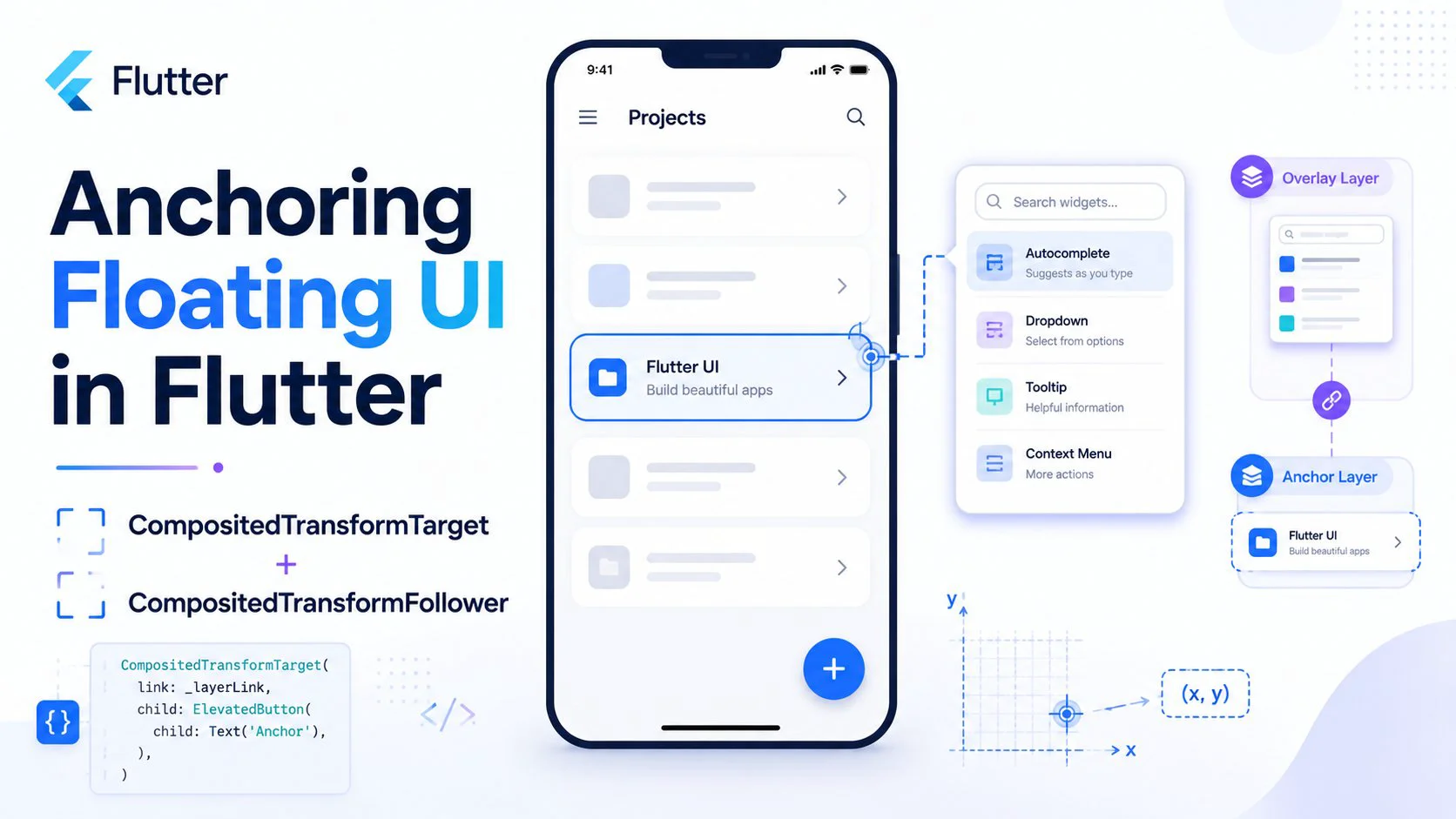
Flutter ships a pair of widgets built precisely for this: CompositedTransformTarget and CompositedTransformFollower, coordinated by a LayerLink. They let you mark one widget as an anchor and have another widget track its exact screen position — even though the follower lives in a completely different part of the widget tree (usually the Overlay).
This post walks through how they work, why they beat manual position math, and how to build a real, reusable anchored popover.
The problem with measuring positions yourself
A naive approach to floating UI looks like this: grab the anchor's RenderBox, call localToGlobal, compute where the panel should go, and drop it into an OverlayEntry with a Positioned widget.
final box = context.findRenderObject() as RenderBox;
final offset = box.localToGlobal(Offset.zero);
// place the panel at offset.dx, offset.dy + box.size.height ...
This works for exactly one frame. The moment the anchor moves — a parent scrolls, the keyboard appears, the device rotates — your cached offset is stale and the panel drifts away from its anchor. You end up listening to scroll notifications, layout callbacks, and orientation changes just to recompute a number that Flutter already knows.
CompositedTransformFollower sidesteps all of that. Instead of copying a position once, it follows the anchor's layer every frame at the compositing stage. When the anchor moves, the follower moves with it automatically.
The three pieces
There are only three things to learn.
LayerLink is a lightweight, shareable handle that connects a target to its followers. You create one, hold onto it (typically as a field in a State), and hand it to both widgets. It carries no UI of its own.
final LayerLink _link = LayerLink();
CompositedTransformTarget wraps the anchor widget. During compositing it registers a leader layer against the link, recording the anchor's current transform and size.
CompositedTransformTarget(
  link: _link,
  child: const Icon(Icons.more_vert),
)
CompositedTransformFollower wraps the floating widget. It creates a follower layer that copies the leader's transform on every frame, so its child renders relative to the target no matter where the target ends up on screen.
CompositedTransformFollower(
  link: _link,
  child: myFloatingPanel,
)
A LayerLink connects to a single target at a time, but multiple followers can track the same target — handy if, say, a highlight ring and a tooltip both need to point at the same button.
Aligning the follower to the target
By default the follower's top-left corner sits on the target's top-left corner, so the panel covers the anchor. Three properties control where the floating content actually lands.
targetAnchor is the point on the target you want to attach to. followerAnchor is the point on the follower that gets placed there. Both take an Alignment. To hang a menu directly below a button, attach the follower's top edge to the target's bottom edge:
CompositedTransformFollower(
  link: _link,
  targetAnchor: Alignment.bottomLeft,   // bottom-left of the button
  followerAnchor: Alignment.topLeft,    // top-left of the menu
  child: menu,
)
offset adds a final nudge in logical pixels after the anchors line up — perfect for a small gap between the button and the menu:
offset: const Offset(0, 8), // 8px of breathing room below
Thinking in terms of these two anchors is far more robust than computing coordinates. "Top-center of the panel attaches to bottom-center of the chip" reads clearly and survives every layout change.
A few common pairings:
targetAnchor: Alignment.bottomLeft, followerAnchor: Alignment.topLefttargetAnchor: Alignment.topCenter, followerAnchor: Alignment.bottomCentertargetAnchor: Alignment.topRight, followerAnchor: Alignment.topLeftshowWhenUnlinked
CompositedTransformFollower has one more property worth knowing: showWhenUnlinked. When the follower can't find its leader — because the target hasn't been laid out yet or has been removed from the tree — this flag decides whether the follower paints at its own unanchored location or hides entirely.
For anchored popovers you almost always want showWhenUnlinked: false. Otherwise, for a frame or two, the panel can flash in the wrong place (usually the top-left of the screen) before the link is established.
Putting it together: a reusable anchored popover
Here's a complete, self-contained widget. Tapping the button opens a menu that hangs beneath it, tapping outside or selecting an item closes it, and the menu stays attached to the button even while the page scrolls.
import 'package:flutter/material.dart';

class AnchoredMenuButton extends StatefulWidget {
  const AnchoredMenuButton({super.key});

  @override
  State<AnchoredMenuButton> createState() => _AnchoredMenuButtonState();
}

class _AnchoredMenuButtonState extends State<AnchoredMenuButton> {
  final LayerLink _link = LayerLink();
  OverlayEntry? _entry;
  bool _isOpen = false;

  void _toggle() => _isOpen ? _close() : _open();

  void _open() {
    _entry = _buildEntry();
    Overlay.of(context).insert(_entry!);
    setState(() => _isOpen = true);
  }

  void _close() {
    _entry?.remove();
    _entry = null;
    if (mounted) setState(() => _isOpen = false);
  }

  OverlayEntry _buildEntry() {
    return OverlayEntry(
      builder: (context) {
        return Stack(
          children: [
            // Full-screen barrier: a tap anywhere outside the menu closes it.
            Positioned.fill(
              child: GestureDetector(
                behavior: HitTestBehavior.translucent,
                onTap: _close,
              ),
            ),
            CompositedTransformFollower(
              link: _link,
              showWhenUnlinked: false,
              targetAnchor: Alignment.bottomLeft,
              followerAnchor: Alignment.topLeft,
              offset: const Offset(0, 8),
              child: Material(
                elevation: 4,
                borderRadius: BorderRadius.circular(8),
                child: SizedBox(
                  width: 220,
                  child: Column(
                    mainAxisSize: MainAxisSize.min,
                    children: [
                      _item(Icons.person_outline, 'Profile'),
                      _item(Icons.settings_outlined, 'Settings'),
                      _item(Icons.logout, 'Sign out'),
                    ],
                  ),
                ),
              ),
            ),
          ],
        );
      },
    );
  }

  Widget _item(IconData icon, String label) {
    return ListTile(
      leading: Icon(icon),
      title: Text(label),
      onTap: _close,
    );
  }

  @override
  void dispose() {
    _entry?.remove(); // never leak an overlay entry
    super.dispose();
  }

  @override
  Widget build(BuildContext context) {
    return CompositedTransformTarget(
      link: _link,
      child: ElevatedButton.icon(
        onPressed: _toggle,
        icon: const Icon(Icons.menu),
        label: Text(_isOpen ? 'Close' : 'Menu'),
      ),
    );
  }
}
A few things make this work cleanly:
The follower lives inside an OverlayEntry, not next to the button in the tree. That's the whole point — overlay content paints above everything else and isn't clipped by parents, while the LayerLink keeps it visually tied to the button across the tree boundary.
The barrier GestureDetector with HitTestBehavior.translucent captures taps in the empty space around the menu so the popover dismisses naturally, the way users expect.
dispose removes the entry. An OverlayEntry is not part of the normal widget lifecycle, so if you forget this and the widget is destroyed while open, you leak the entry and may hit a "setState after dispose" error. The mounted check in _close guards the same hazard.
Things that trip people up
Overlay.of(context) needs an overlay above it. MaterialApp and CupertinoApp insert one for you, so this is rarely an issue — but if you build a bespoke app root without one, the lookup fails.
The follower's child should size itself. CompositedTransformFollower adopts its child's size, so give the floating content a concrete width (or wrap it so it has bounded constraints). An unconstrained Column or Row inside it will misbehave.
It anchors position, not visibility or animation. The link only tracks the target's transform. Opening and closing logic, fade or scale transitions, and dismiss-on-tap are all yours to add — wrap the panel's child in an AnimatedOpacity or a transition of your choice.
It won't keep the panel on-screen. If the anchor sits near the bottom edge, a downward menu can run off the screen. The widgets don't auto-flip. For that you'll measure available space (via the target's RenderBox or a LayoutBuilder) and choose your anchors accordingly, or reach for a package like flutter_portal that layers convenience on top of this same machinery.
When to reach for the built-ins instead
If you just need a standard dropdown, DropdownButton, MenuAnchor, PopupMenuButton, or Autocomplete already wrap this pattern and handle edge-flipping and keyboard navigation for you. Internally, several of them use CompositedTransformTarget/Follower — you're using the same engine, just at a higher level.
Drop down to the raw widgets when you need full control over the panel's content, appearance, and behavior — custom popovers, coach marks, floating editors, anchored search results — anything the stock components don't quite cover.
Wrapping up
CompositedTransformTarget and CompositedTransformFollower turn "keep this panel stuck to that button" from a frame-by-frame measurement chore into a declarative relationship. You name an anchor, name a follower, describe how their edges line up, and Flutter's compositor keeps them aligned for free. Once the pattern clicks, it becomes the natural foundation for every floating element in your app.
Happy coding : )

Loading…